The Properties button in the Page Actions Toolbar near the top of the page contains information about the page. You must have the page checked out to you to see all the options.
The Page Parameters section, which can be selected from the left menu or in the Page Parameters Gadget, contains the following options.
Title and Metadata
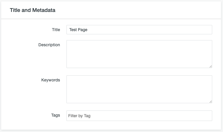
- Title: This is used as the page title for interior pages and within the metatitle (the text that shows in the tab of your browser) for all pages.
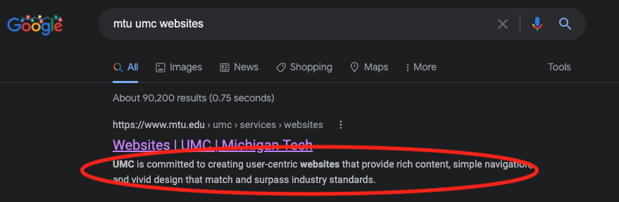
- Description: This is the meta description for the page. It is text that provides a description of the content on your page and is commonly used in search engine results as a preview of what is on the page. This should always be filled out and be an accurate summary of the content on your page that is no more than two to three sentences.
- Keywords: The keywords field is no longer used for search engine optimization, but quality assurance software still recommends that you have at least one keyword phrase listed. List the most important, descriptive phrase for your webpage, such as “computer science bachelor’s degree.” Listing additional keyword phrases does not hurt, but also does not help anything.
- Tags: Used within Modern Campus CMS to categorize pages and files so that it is easier to search for and filter them. We typically do not use the Tags functionality.
Custom Settings
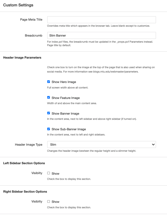
- Page Meta Title: This can be used to override the default meta title in special cases. Typically, you should not use this field unless instructed to do so.
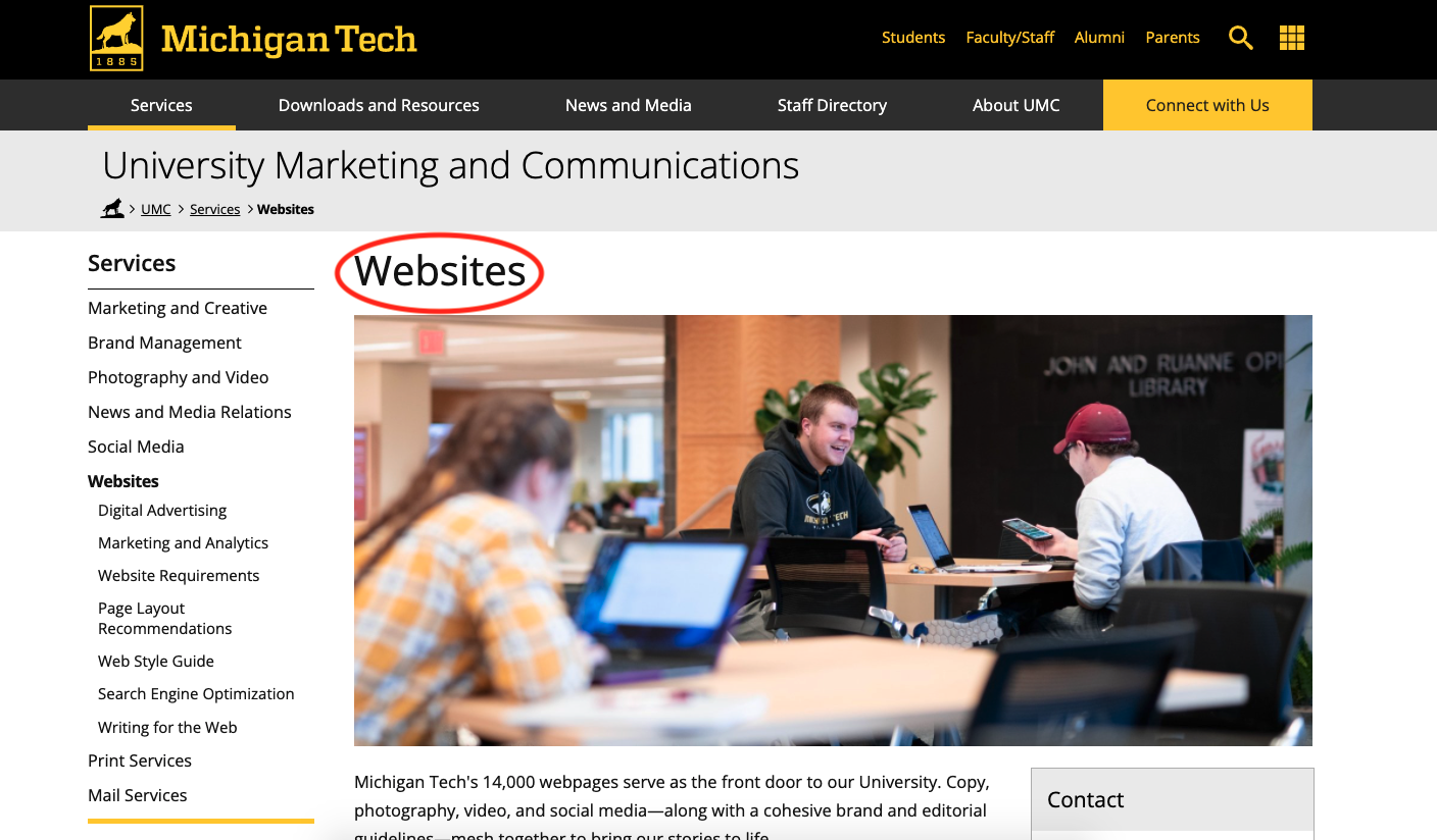
- Breadcrumb: If the page you are editing has a filename of index.pcf this field is not used. For additional pages within a folder that are named something other than index.pcf this field will set the page breadcrumb (in the light grey space at the top of the page below the site title).
- Header Image Parameters: If desired, check the Show box next to one location if you want the header image to display. Aside from being displayed on the page itself, the header image is what will be shown when the page is shared on social media and other locations. You can include text over image, pop-up, or video media types with all selections from the MultiEdit Content menu. For any of the options you should use the Image Editor to crop a Banner image type and insert the largest size created in MultiEdit Content.
- Show Hero Image will display the main page image as a full screen-width feature image that is above all other content. This is typically used on homepages and possibly other key landing pages.

- Show Feature Image will display the main page image above the content area including left and right sidebars, extending from the left side of the left sidebar to the right side of the right sidebar. This is typically used when the available image is not large enough or high enough quality to use in the Hero layout.
- Show Banner Image will display the main page image within the content area next to the left sidebar and above the right sidebar (if turned on). If the left sidebar is not turned on, use the Feature option instead.

- Show Sub-Banner Image will display the main page image within the content area between the sidebars. If only the left sidebar is turned on, use the Banner option instead. If no sidebars are turned on, use the Feature option instead.

- Show Hero Image will display the main page image as a full screen-width feature image that is above all other content. This is typically used on homepages and possibly other key landing pages.
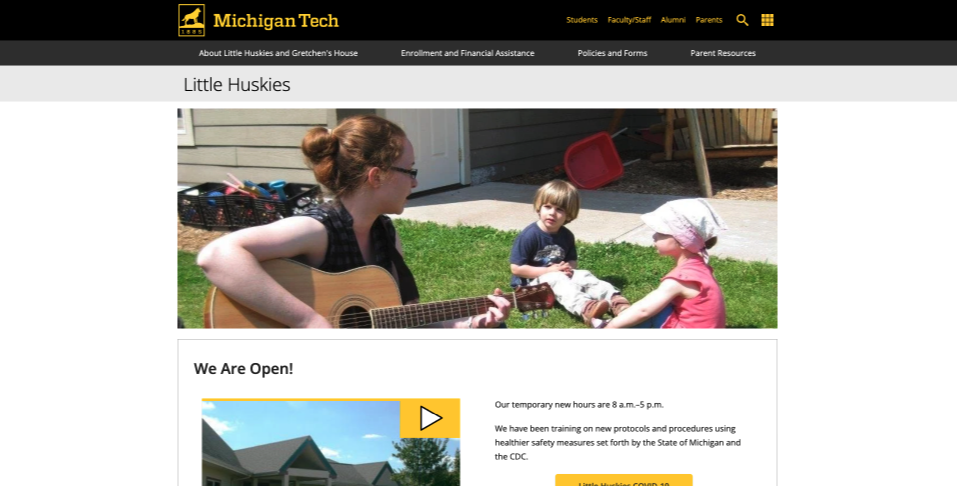
- Header Image Type: Change the dropdown menu from Regular to Slim to make the header image shorter. You will still use the Banner image type in the Image Editor, but the system will use the middle section of the banner image that you insert. The Slim type cannot be used with the Video/360 Image Media Type. The Slim option is used when the header image is decorative only and the content on the page needs to be available higher.
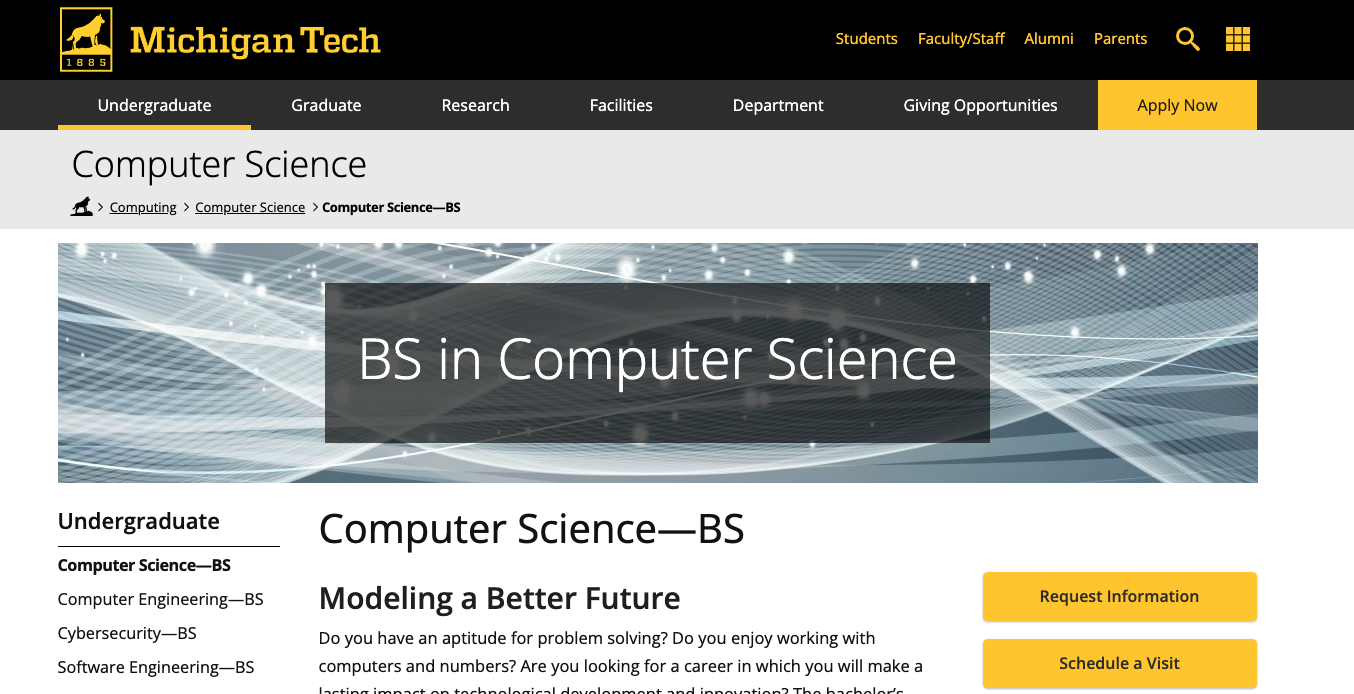
An example of a Slim Feature header image layout. - Left Sidebar Section Options: The Show box controls the visibility of the left sidebar. The left sidebar should be off on all homepages or if there are no links below the sidebar heading. On all other pages where there are links below the heading, the left sidebar should remain on.
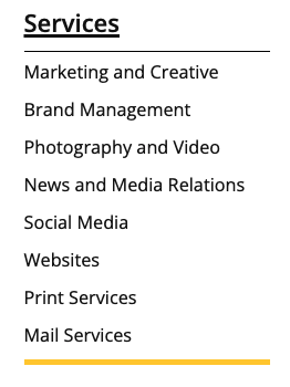
An example of a left sidebar that has links after the heading. - Right Sidebar Section Options: The Show box controls the visibility of the right sidebar. The right sidebar is completely optional and can be used for extra information. On a mobile device, the right sidebar would be displayed after the regular content.
Save your changes.