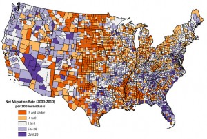
A project headed by Richelle Winkler (SS) was covered in an article by The Atlantic Cities online and also Maptacular on Tumblr.
From Tech Today.
Mapping 60 Years of White Flight, Brain Drain and American Migration
You can tell a lot about a place by who doesn’t want to be there any more. Or, conversely, by who wants to move in.
Researchers at the University of Wisconsin, Michigan Technological University and the University of New Hampshire have built just such a database dating back to the 1950s. Their tool tracks net changes in population by county, all across the country…
Read more at The Atlantic Cities, by Emily Badger.
Net Migration Patterns for US Counties
Every year, about 10 million Americans move from one county to another. Migration rates vary by age, race, and ethnicity and with local and national social and economic conditions over time.
Suggested Citation:
Winkler, Richelle, Kenneth M. Johnson, Cheng Cheng, Jim Beaudoin, Paul R. Voss, and Katherine J. Curtis. Age-Specific Net Migration Estimates for US Counties, 1950-2010. Applied Population Laboratory, University of Wisconsin- Madison, 2013. Web.
Image courtesy of the net migration mapping tool created by the Applied Population Laboratory at the University of Wisconsin.
In the News
Richelle Winkler’s research has been the focus of several news stories recently. She is featured in a recent issues of The Capital Times, Wisconsin State Journal, and Gizmodo. The articles discuss current US migration patterns.
From Tech Today.
A Map of Where Americans Are Moving (Hellooooo, Vegas!)
The coolest thing is playing with the data on the website, where you can cut and slice the data between counties and start to see some trends up close, especially when it comes to the age of who is moving.
Read more at Gizmodo, by Alissa Walker.