There are three button colors that can be used in the CMS. They can easily be created when you set up your link or you can use the Buttons in a Row snippet to create multiple buttons in a row.
Primary Button
Good for calls-to-action, think of it as a main purpose for a user on a page. You can find an example on our Apply page.
Secondary Button
This button compliments a primary button in some format. Generally, you only use this button if you already have a primary button somewhere on your page.
Styled Button
If you’re looking to have a link that is a bit more stylized but not necessarily a call to action, this is a good option. These links can be seen on our homepage as the link to more news and on profiles with CV’s. This is the default button style in the Buttons in a Row snippet, the RSS Feed Combined snippet, and the Top Title option of the H2|H3 Stylized Headings snippet.
Put it All Together
You can see all of the button styles in use on the UMC Website Services page. The main actions a user can take from this page, request a project or request a URL, are primary buttons. Additional important information links are a bit lower on the page and use the secondary button. Finally, in the sidebar, you can see the styled buttons linking to other information.
Creating a Single Button in the CMS
JustEdit Editor in an Editable Region
- Type the text you want to be in the button.
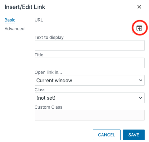
- Select the text and choose the Insert/edit Link icon from the toolbar.

- Enter the URL for the button to link to or select the appropriate CMS link using the file picker.

- From the Class dropdown at the bottom of the window choose “Link Button Yellow,” “Link Button Black,” or “Link Button Blank.”
- Click the Save button.
“Mini Editor” in an Asset or MultiEdit Content
- Type the text you want to be in the button.
- Select the text and choose the Insert/Edit Link icon from the toolbar.

- Link the text using the Link URL field.

- In the Class field choose (custom).
- Enter the appropriate button code in the Custom Class field (without quotation marks).
- “button” for a yellow button
- “button-black” for a black button
- “button-blank” for a blank button
- Insert.
Creating Multiple Buttons in a Row
Use the Buttons in a Row Snippet to create multiple buttons in a row.