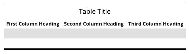
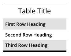
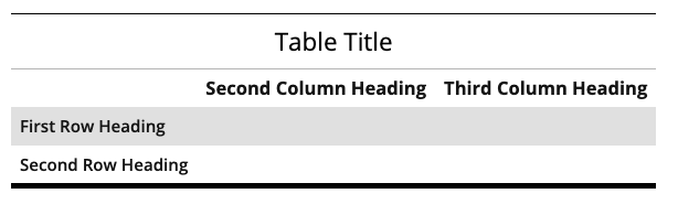
This snippet creates Slider or FAQ styled accordions. Clicking on one of the accordions would open or close that section. Each row in the snippet will create one accordion. Creating three or more accordions within one snippet would automatically add an Expand All/Collapse All link at the top right. If you have more than seven accordions together, it is recommended that you try to split them into multiple categories.
This snippet creates a single card with text over an image or colored background that links to another page or website. The slide out button can be customized. The spacing around each card is controlled in the Boxed Sections snippet that the Card is inserted into.
This snippet creates a row of solid or hollow colored circles for statistic touting. The number or ranking part of the statistic goes into the shape and the remaining text appears beneath. The circles could have background images instead of solid color. The font colors are predetermined and cannot be changed.
This snippet allows you to add classes to an unordered list that affect the styling. The is used when you have a list of many links rather than having them in paragraph form.
This snippet will create a grid of thumbnail images that pop up into a scrollable gallery when a thumbnail is selected or a gallery of larger images that the user can scroll through that also pop up into a larger image. For the thumbnail option, only the pop-up image will display the title caption, but they will be displayed on the page for the gallery option.
This snippet will automatically flow multiple images or other items into a grid layout. The size of the image will be maintained. This is a great option for displaying multiple logos or other images that do not fit into the predefined Image Editor sizes.
This snippet allows you to create a link or button on the page that opens a pop-up window displaying text. The pop-up can include headings, links, and images.