This snippet creates a single card with text over an image or colored background that links to another page or website. The slide out button can be customized. The spacing around each card is controlled in the Boxed Sections snippet that the Card is inserted into.


This snippet must always be inserted into a column of a Boxed Sections snippet. You can create multiple rows of cards by adding additional rows to the Boxed Sections snippet.
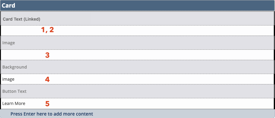
- Enter the desired text that will be displayed on the card.
- Select the text you entered and insert a link to another CMS page or external URL.
- If including an image in the background, crop the Card type with the Image Editor and, using the Insert/Edit Image icon
 , insert the largest size card that was cropped.
 - If not including an image, change the selection to the desired background color. Because our recruitment materials use only our primary brand colors, we recommend only MTU Gold, Black, and Dark Gray options be used on websites involved with recruitment. For other websites, secondary colors can be used as an accent.
- When using this snippet in an asset you must type in the code for the desired color (without quotation marks):
- For MTU Gold enter “gold”.
- For Black enter “black”.
- For Dark Gray enter “medium-gray”.
- For Deep Gold enter “deep-gold”.
- For Teal enter “teal”.
- For Copper enter “copper”.
- When using this snippet in an asset you must type in the code for the desired color (without quotation marks):
- Change the default button text if alternate wording is desired. The text should be 2-3 words indicating an action and in title case. Some examples include Learn More, Read Now, See Results, or Request Now.
You should add two, three, or four Card snippets in a row.
Play Card Snippet video
