A form asset can be set up to collect information from users that can be submitted via email with the option to also collect it in a database within the CMS. You can configure form elements, email messages, and success or failure messages.
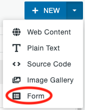
From the assets screen, click on the arrow next to the +New button in the upper right corner and select Form.
Asset Info and Access Settings
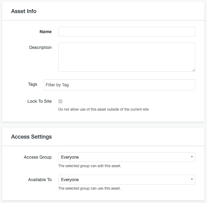
- Name: Enter the name for the asset. Start the name with your site URL in brackets to keep things organized.
- Description: Enter a description for the asset, if desired.
- Tags: Assets can be filtered by tag. Enter tag information, if desired.
- Lock to site: Skip this item.
- Access Group: Select the site name from the dropdown so that only people with access to edit your site can edit your asset.
- Available To: This can be left at Everyone if you think it may be useful in other sites. If you set this to your site name, it can only be used within your site.
Form Elements
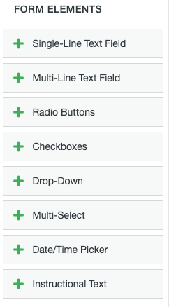
Next you will add the Form Elements, the fields that the user will fill out. Click the plus icon next to the type of field you want to add in the menu on the left. You will be able to rearrange the fields by clicking the header section of the field and dragging it up or down.
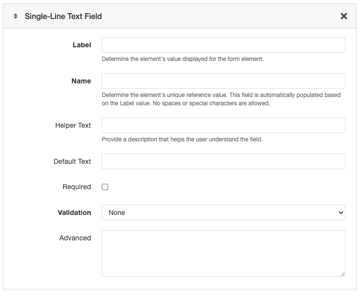
Almost all elements, except Instructional Text, have common fields that you will fill out.
- Label: The text describing the field, such as First Name.
- Name: This field will automatically populate based on what you entered in the Label field. You can change it to be shorter if desired, but it must be all lower case letters only. This may be used to reference this field in code and as the heading for the field in the database and email.
- Helper Text: You can choose to enter a longer description to help the user fill out the field.
- Required: Check the box if the user must fill out this field.
- Failure Message: This field will appear if you choose Required or one of the Validation methods other than None. Enter text that will appear if the user doesn’t meet the requirement. An example would be “A valid email address is required.”
- Advanced: This field is used for advanced operations. New operations may be added at any time.
Single-Line Text Field
This element will allow the user to enter short answers. This is good for name, phone number, email, address, or similar fields.
Additional fields you will see in this element are:
- Default Text: You can choose to enter an example of what should be entered in the field that will disappear when the user clicks into the field.
- Validation: Choose an option from the dropdown if you want the system to verify the information entered by the user.
- Email Address: Will make sure the entry includes @ followed by text, a period, and additional text.
- Minimum Length: Will make sure the entry includes at least a certain number of characters. You will set the minimum length in an additional field that appears if this option is selected.
- Regular Expression: This is an advanced method for verification using standard Regular Expression code that is entered in an additional field that appears if this option is selected.
Multi-Line Text Field
This element will allow the user to enter longer answers that may include multiple paragraphs. It provides a larger entry box that expands as needed.
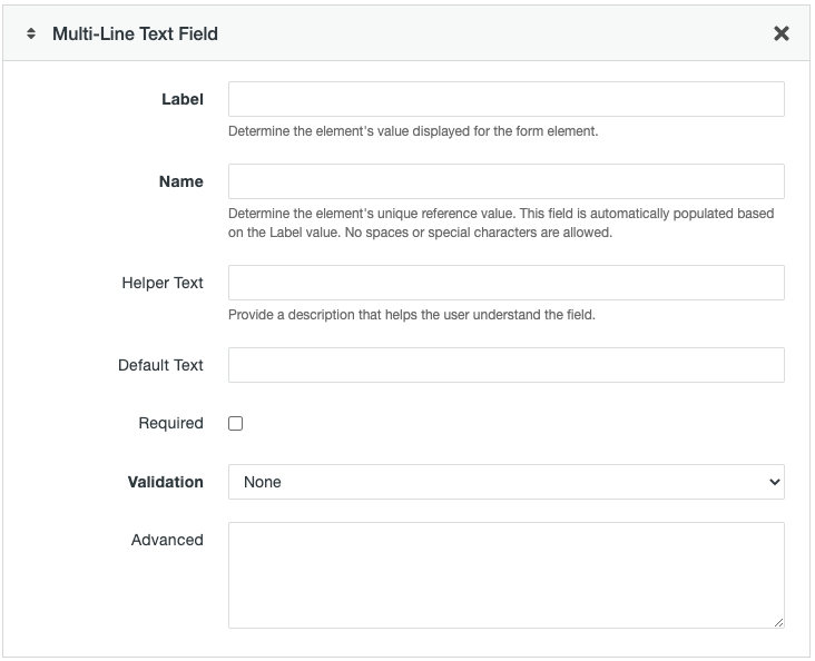
Additional fields you will see in this element are:
- Default Text: You can choose to enter an example of what should be entered in the field that will disappear when the user clicks into the field.
- Validation: Choose an option from the dropdown if you want the system to verify the information entered by the user.
- Email Address: Will make sure the entry includes @ followed by text, a period, and additional text.
- Minimum Length: Will make sure the entry includes at least a certain number of characters. You will set the minimum length in an additional field that appears if this option is selected.
- Regular Expression: This is an advanced method for verification using standard Regular Expression code that is entered in an additional field that appears if this option is selected.
Radio Buttons
This element creates a field with multiple, predefined items of which one and only one can be selected by the user. You should use this option instead of drop-down when you have 7 or fewer options to select from.
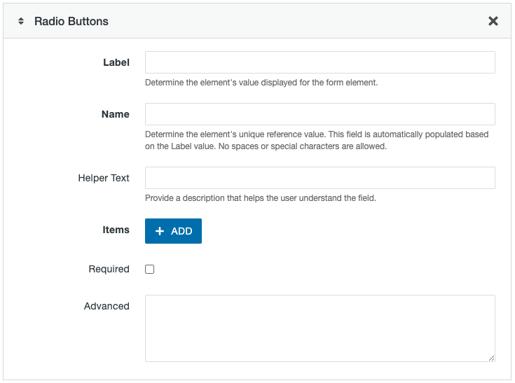
Additional fields you will see in this element are:
- Items: Click the +Add button for each option you need to list. Enter the text in the field for each option. You can change the order of the options by clicking and dragging the up/down arrows to the left of each option. Use the x to the right to delete an option.
Checkboxes
This element creates a field with multiple, predefined items of which none, one, or more than one can be selected by the user.

Additional fields you will see in this element are:
- Items: Click the +Add button for each option you need to list. Enter the text in the field for each option. You can change the order of the options by clicking and dragging the up/down arrows to the left of each option. Use the x to the right to delete an option. If you select one or more of the options when creating or editing the form, those items will be preselected on the live page also.
Drop-Down
This element gives users the ability to select an item from a list of predefined options using a dropdown style menu. You should use this option instead of radio buttons when you have 8 or more options to select from.
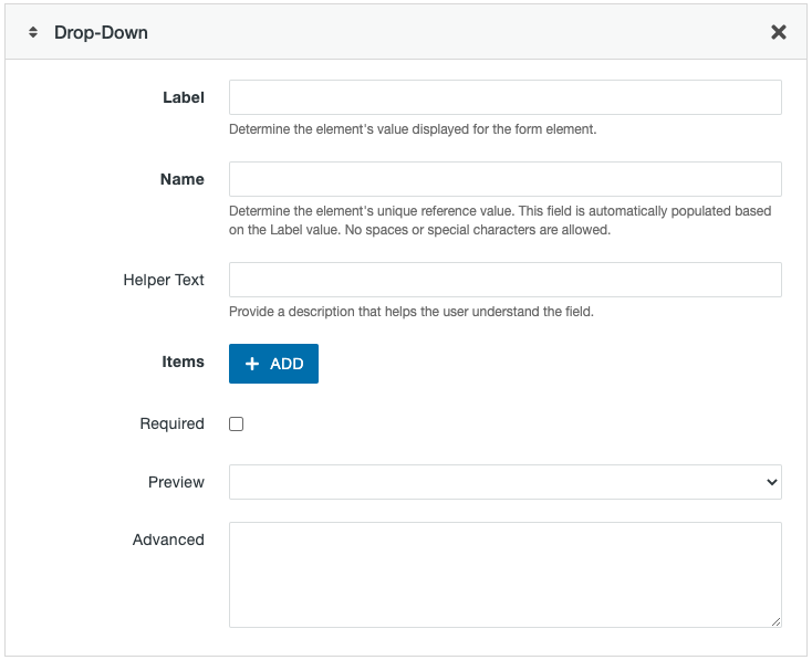
Additional fields you will see in this element are:
- Items: Click the +Add button for each option you need to list. Enter the text in the field for each option. You can change the order of the options by clicking and dragging the up/down arrows to the left of each option. Use the x to the right to delete an option.
- Preview: The option that appears in the Preview field is the default option the user will see on the live page. You can change this by selecting the desired option from the Preview dropdown.
Multi-Select
This element includes the ability to select multiple items from a list using the keyboard shortcut CTRL + click on a PC.

Additional fields you will see in this element are:
- Items: Click the +Add button for each option you need to list. Enter the text in the field for each option. You can change the order of the options by clicking and dragging the up/down arrows to the left of each option. Use the x to the right to delete an option.
- Preview: The option that appears in the Preview field is the default option the user will see on the live page. You can change this by selecting the desired option from the Preview dropdown.
Date/Time Picker
This element allows users to select a calendar date and/or time of day.
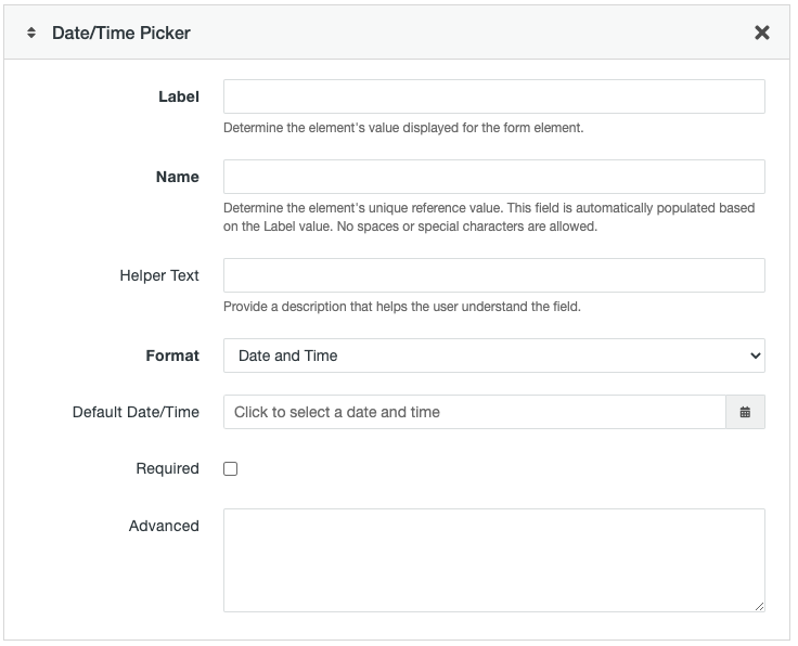
Additional fields you will see in this element are:
- Format: Choose from Date and Time, Date, or Time.
- Default Date/Time: Set a default if desired, otherwise leave blank.
Instructional Text
This element allows you to include additional text within the form. A mini-editor will allow you do format and configure the text to be displayed. Images, videos, and other media can not be included. Users will not submit any data with this element.

This element does not include all the standard fields that are found in the other elements. Other than Name and Advanced you will enter your text for the user in the Instructional Text mini-editor field.
Email Messages
The next section is where you will set up Email Messages. A user submitting a form will trigger the configured message(s) to be sent. You can create multiple messages to be sent and a single message can be sent to multiple people.
- Click the +Add button in the Email Messages section to create a new email message.
- In any field you can reference one of the form elements to include the data entered in that field by the user. To do this, enter {{ and a list of the form elements will appear. Click on the element you want to refer to. You will end up with something like {{Name}} where Name is the value in the Name field for that form element.
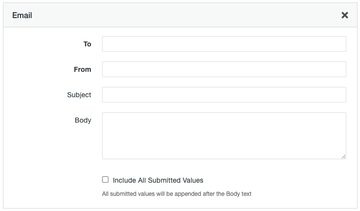
- To: Enter the email address that the message should be sent to. Separate multiple addresses with a semi-colon (;). If you use a comma or any spaces it will break the form.
- From: Specify the email address that should appear as the sender.
- Subject: Enter text to appear in the subject line of the email message.
- Body: This is the content that will appear in the body of the email. There is a 3,000 character limit.
- Include all submitted values: Select this checkbox to display all data from the form in the message.
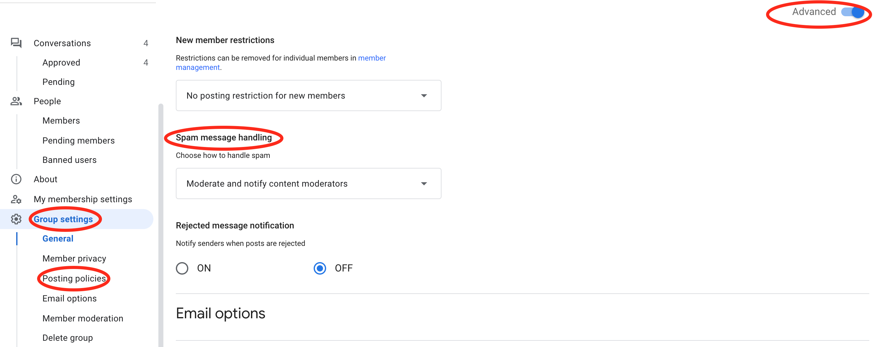
Note: If you are setting the To: field to a Google Group email address and the form is submitted by someone with an email address other than mtu.edu, those emails will go into your Pending messages on your Group unless you change the Group Settings > Posting Policies > Advanced > Spam message handling option to either “Post suspicious messages to the group” (you’ll get all the spam messages) or “Moderate and notify content moderators” (you’ll get one email once in a while that lists all of the spam messages and you can choose to release certain ones).
Form Settings
Finally, you will complete the Form Settings section which includes success and failure messages.
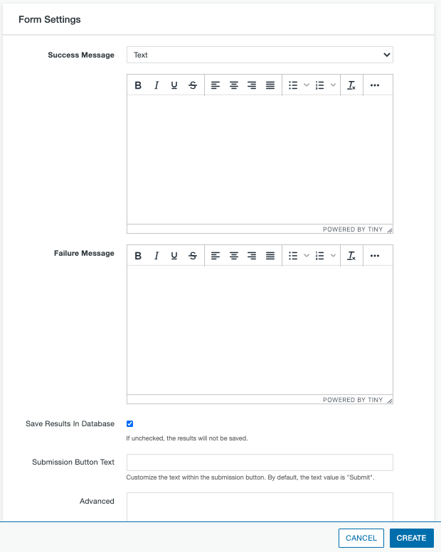
- Success Message: From the dropdown, choose Text to create a custom message that will appear on the screen or URL Redirect to specify a different webpage that the user will be brought to when the form is successfully submitted. If you choose Text, enter the content for your message in the mini editor window beneath the dropdown.
- Failure Message: Enter the content for a message that will appear on the screen if the user tries to submit the form, but does not correctly complete all the required or validated fields.
- Save Results in Database: Leave this option selected to save all results within a database in the Modern Campus CMS system.
- Submission Button Text: By default, the text on the submission button is “Submit.” Enter text in this field to change that to a different label.
- Advanced: This field is used for advanced operations. Additional information about the use of this field can be found at mtu.edu/webmaster/advanced-forms as this information may change frequently.
When you have completed all form options, click the Create button to create the asset. Be sure to publish the asset then insert the asset onto your page for users to access. Once the page is live, it is recommended that you submit a test form to be sure it works as expected.