Being a web professional at a university can be difficult. Department chairs say things like “I want a website that looks different from everyone else.” A liaison says “I want the newest, craziest, most different website that you can make.” Everyone wants ‘cutting edge,’ although they don’t know what that means or why they are asking for it.
Those who don’t work in the web profession get lost in flashy designs, zany animations, and sparkles. They rarely analyze how many clicks it takes to get to the real information, how accessible a website is to those with disabilities, or how user-friendly a website is on an iPhone. They just want to be ‘wowed.’ Does their audience really want to be wowed, though?
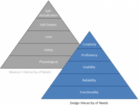
Design Hierarchy of Needs
The problem is that creativity is the least important part of the web design pyramid. A website cannot be successful if it is not functional, first and foremost. It also should be reliable and usable.

3.7 Designs has a nice article that discusses this issue by relating it to Maslow’s Hierarchy of Needs.
My Digital Services team puts the focus back on making websites that are functional, reliable, and usable first and foremost. We understand why you are asking for “new and fancy” websites and we are working on new CMS templates to accommodate this. However, let’s not lose focus on what makes a website truly effective: good, readable content organized within an intuitive navigation structure and usable interface.
Joel Vertin
Digital Services Manager