UMC has a limited subscription to an analytics service called Crazy Egg. This is a great tool to use in conjunction with Google Analytics that can give visual information about user habits on a single page. The reports include a heatmap of user clicks, a scrollmap of how far down the page users are scrolling, confetti showing specific clicks with a secondary dimension, and an overlay option that provides even more details.
Since Crazy Egg is set up on a page-by-page basis it is better suited for your most important pages, such as homepages, and you do have to plan ahead as it must be set to begin gathering data and then runs for up to 60 days. It is a bit harder to use this tool for historical comparisons but is a great tool to use in advance of a site or homepage redesign.
To request Crazy Egg analytics, email webmaster@mtu.edu with the URL of the specific page you’d like analyzed and what you hope to use the information for. The default snapshot tracking is 60 days or 25,000 visits, whichever comes first. A limited number of pageviews is available each month, so you can only request one webpage at a time and your request may need to be scheduled at a later time if there are a lot of snapshots already running.
Once your snapshot has completed, UMC will send you the reports. You will receive a copy of each report for desktop, tablet, and mobile.
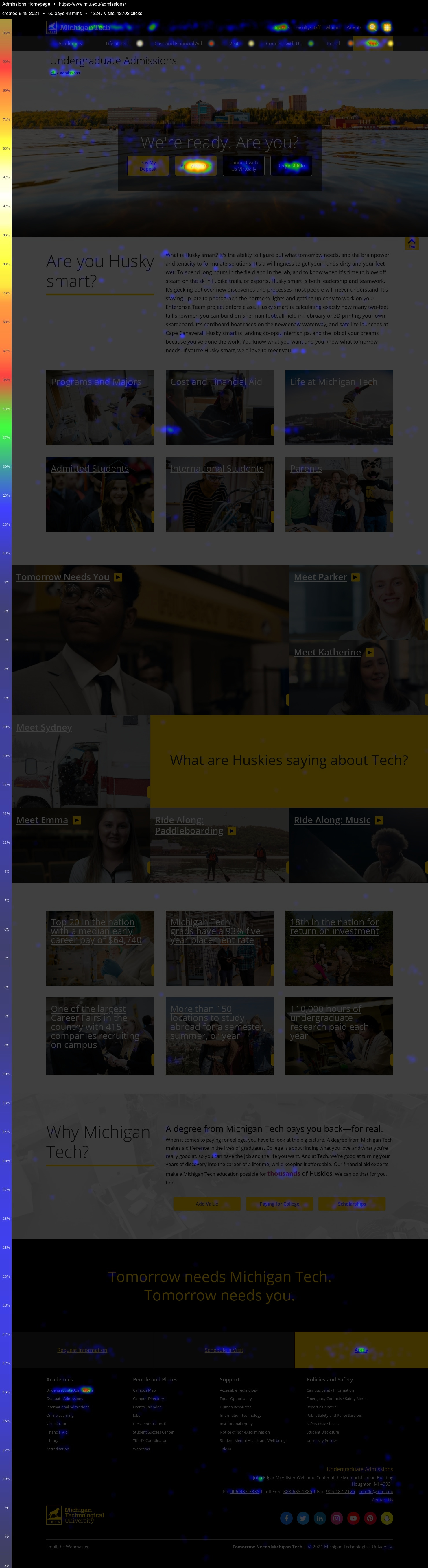
Heatmap
On this example heatmap report, you can see colored areas which tell you where the users were clicking. The brighter (hotter) the color, the more clicks in that spot. This could be used to test link placement or wording for your call-to-action by having multiple options on the page while the data is gathered. This can also show you what links a user finds important, which can help when planning a redesign.
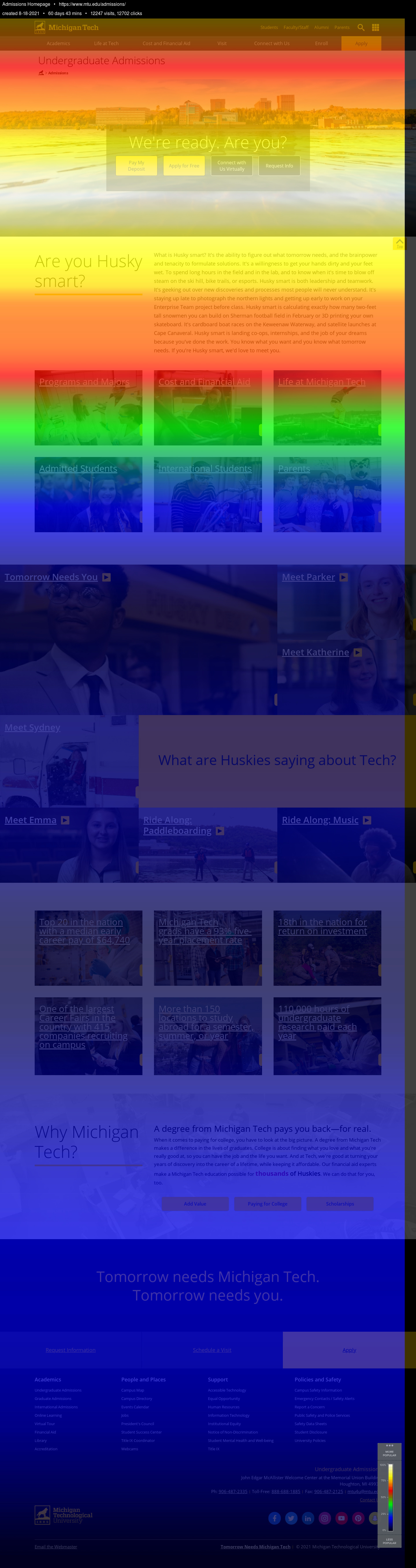
Scrollmap
On this example scrollmap report, the brighter colors show you how far users are scrolling on the page. A short scroll distance may mean that you are providing what the user is looking for at the top and they have no need to go further or perhaps they are frustrated with the content on your page and are not looking at the whole thing. You may also determine that you have to move important links or buttons higher on the page to ensure users are scrolling far enough to see them.
This report also shows what users scroll past, where they spend time, when they resume scrolling, and where they actually start to drop off. White and red spots show where people spent time looking at a section, while blue spots show that users scrolled past that content or exited the page completely.
Confetti
On this example confetti report, you will see where users are clicking on the page broken down and color-coded by different segments. In the example, there are 18 pages each showing a different segmentation, such as new vs returning users, referrer, or country. This can help you determine what links may be important to different groups of users.
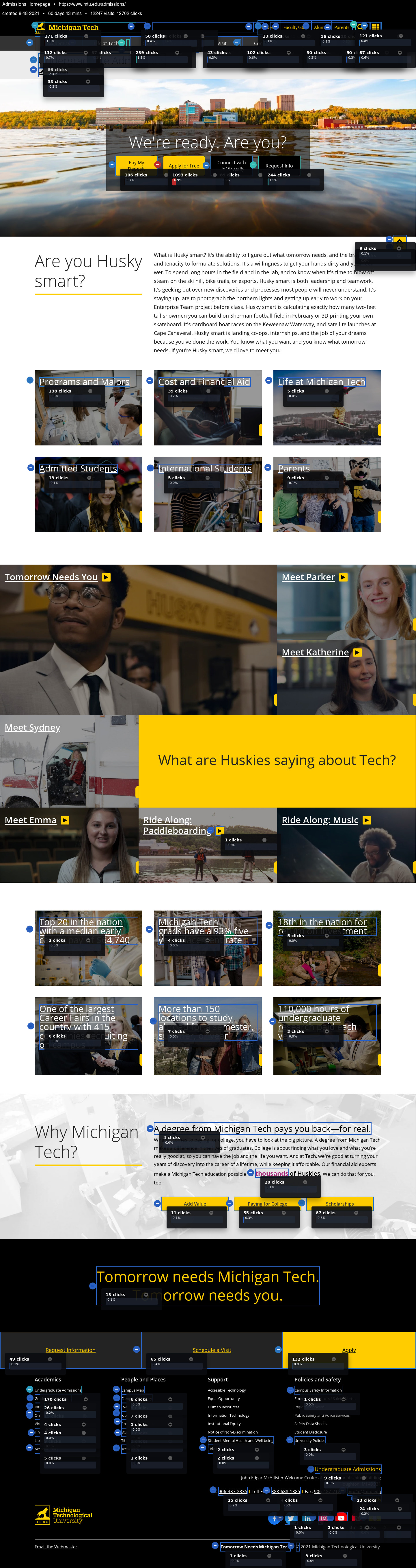
Overlay
This example overlay report shows the number of clicks each element on the page actually received. It will provide actual numbers for the click data.
List
You will also receive a list report which displays a list of all elements that were clicked on the page. It is an Excel file with columns for the element name, element type, number of clicks, and percent.