Data tables present tabular information in a grid. They are made up of columns and rows that communicate the meaning of the information and relationships between data. There are several options for styling your data in tables to allow for a clean, visually appealing look.
The use of HTML tables is reserved for displaying data in an organized manner. It is not proper to use table code to control webpage layout or design. To display content on your webpage in multiple columns, please refer to the Boxed Sections Snippets or the Buttons in a Row Snippet.
View different table styles in the Style Guide.
Steps to Create an Accessible Table
- Insert the table.
- From the table icon
 in the editor go to Insert Table and select the number of rows and columns for the table. Insert the data into the appropriate fields.
- From the table icon
- Add all of the content, including headings, into the table.
- Do not format any of the headings—do not make them bold or apply a heading level to them—leave them as regular text. The following steps to designate header rows and cells will apply the appropriate formatting automatically.
- If you want to style the table as a striped table, sortable table, or one with lines:
- Right-click on the table and choose Table Properties.
- Change the Class to (custom).
- Type in the Custom Class (auto striped, striped, auto striped sortable, or lines).
- Click Save.
- If your table has a title:
- Right-click on the table and choose Table Properties.
- Check the box for Show caption.
- Click Save.
- In the new row at the top of the table enter the text for the title.
- If the first row of the table is headings:
- Right-click in a cell of that row and choose Row Properties.
- Change the Row type to Header.
- Click Save.
- For each cell in the header row that has content in it:
- Right-click in the cell and choose Cell Properties.
- Change the Cell type to Header cell.
- Change the Scope to Column.
- Click Save.
- If the cells in the first column are headings:
- Note: If both the first row and first column are headings, the cell in the upper left corner of the table should be blank and you should not change its Cell type. In other words, you should not have a heading for the column of headings on the left.
- Right-click in each cell and choose Cell Properties.
- Change the Cell type to Header cell.
- Change the Scope to Row.
- Click Save.
General Table Properties
Items marked with * are required for accessibility.
Using the table icon or right-clicking on the table, go to Table Properties.
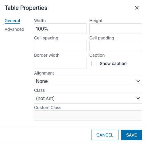
- Width: Used to scale the width of the table, defined in percentage (e.g. use 50% to reduce the width of the table by half). A better option is to use “style=min-width: 100%;” in the <table> of the HTML code so that your tables look good on both desktop and mobile devices.
- Height: Used to scale the height of the table, defined in percentage (e.g. use 50% to reduce the height of the table by half). We do not recommend using this property.
- Cell Spacing: Defines spacing between cells. Typically the default is sufficient.
- Cell Padding: Defines padding within the cell between the border and the text. Typically the default is sufficient.
- Border Width: Defines the thickness of cell border. This property is not required when using the “auto striped” CSS class. Using this field creates an inaccessible table. Instead apply class of “lines” (see below).
- Caption*: Adds a caption field above the table. This field is used for a table heading. All tables are required to have a heading using either this caption or a regular heading immediately before the table.
- Alignment: Aligns the page on the table; options are Left, Center, and Right
- Class: Applies CSS from the Styles drop-down to the table. In order to create a striped table you can select “(custom)” then type “auto striped” or “striped” (without quotation marks) in the blank field below it. Auto striped will automatically alternate stripes on the rows in the table and is recommended. If you use striped you must designate the alternate rows in the code view by adding class=”alt” to the <tr>. You can also begin creating a sortable table by typing “auto striped sortable” (without quotation marks) in the custom class field. More instructions for completing this type of table setup is at the end of this post. One other class you can use is “lines” (without quotation marks) to show the cell borders as an alternative to the Border field.
Advanced Table Properties
In the Table Properties window, select the Advanced tab.

- Border Style: Can be used to select the style of the border lines, if turned on.
- Border Color: Enter a hex code (e.g. #000EEE) to color the borders of your table. This property is typically not needed.
- Background Color: Enter a hex code (e.g. #000EEE) to color the background of your table. This property is typically not needed, but if used the color contrast between the background and the text must meet accessibility requirements.
General Cell Properties
Items marked with * are required for accessibility.
When you have one or more cells selected, right click or go to the table icon, go to Cell and choose Cell Properties.
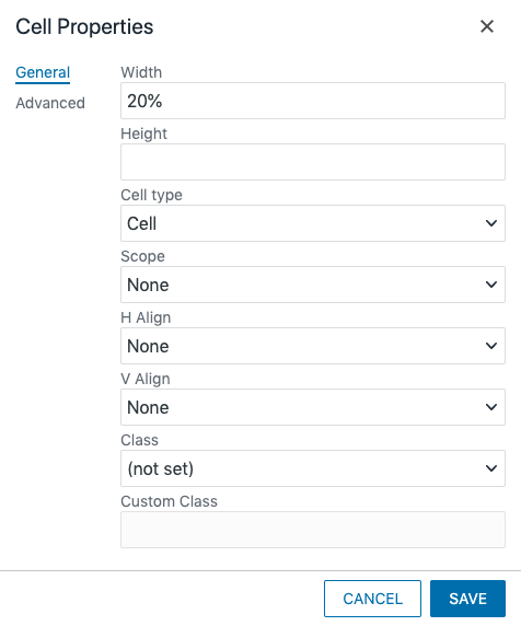
- Width: Used to set the width of the cell, defined in percentage (e.g. use 50% to have this cell be half of the table width). The sum of the widths of each cell within a row must equal 100%.
- Height: Used to scale the height of the cell, defined in percentage (e.g. use 50% to reduce the height of the cell by half). We do not recommend using this option.
- Cell Type*: If the content in the cell is a heading, select Heading from this dropdown. You must then select the scope.
- Scope*: When a cell is a heading, you must define whether it is a heading for the row or the column. Select the appropriate choice from the dropdown. A scope of row means the heading is for the cells to the right of it, col means it is the heading for the cells below it.
- H Align: Sets the horizontal alignment of the content in the cell. This property is typically not needed.
- V Align: Sets the vertical alignment of the content in the cell. This property is typically not needed.
- Class: Applies CSS from the Styles drop-down to the cell. If you want to create a white row in an auto striped table you can merge the cells in the row, then select (custom) here and type “spacer” (without quotation marks) in the blank field beneath it. This field could still have content in it.
Advanced Cell Properties
In the Cell Properties window, select the Advanced tab.
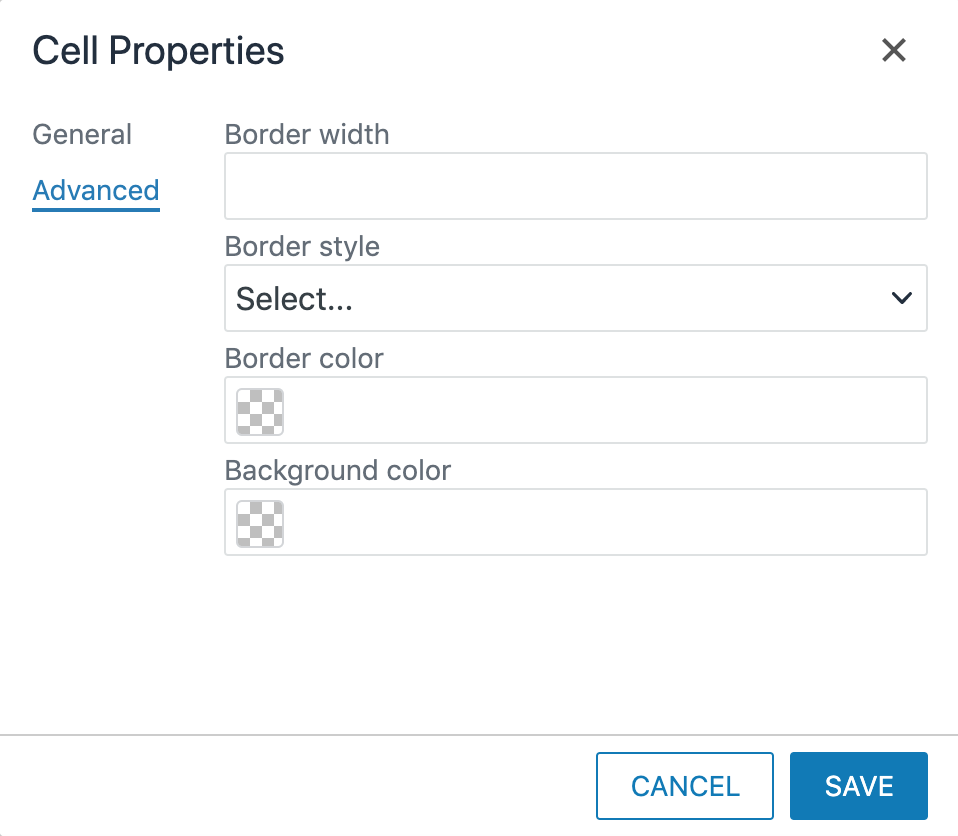
- Border Width: Defines the thickness of cell border. This property is not required when using the “auto striped” CSS class. Using this field creates an inaccessible table.
- Border Style: Can be used to select the style of the border lines for the row, if turned on.
- Border Color: Enter a hex code (e.g. #000EEE) to color the borders of your table. This property is typically not needed.
- Background Color: Enter a hex code (e.g. #000EEE) to color the background of your table. This property is typically not needed, but if used the color contrast between the background and the text must meet accessibility requirements.
General Row Properties
Items marked with * are required for accessibility.
With your cursor in a cell in the row or the entire row selected, right-click or go to the table icon, go to Row, and choose Row Properties.
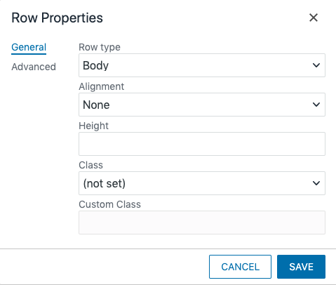
- Row Type*: If you are including a row at the bottom of your table for notes or references, select Footer from this dropdown. This will automatically style the content as notes. For the heading row, you must select Heading, otherwise, it should be Body.
- Alignment: Choose the alignment of the content in the row.
- Height: Used to scale the height of the row, defined in percentage (e.g. use 50% to reduce the height of the row by half). We do not recommend using this option.
- Class: Applies CSS from the Styles drop-down to the row.
Advanced Row Properties
In the Row Properties window, select the Advanced tab.
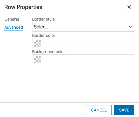
- Border Style: Can be used to select the style of the border lines for the row, if turned on.
- Border Color: Enter a hex code (e.g. #000EEE) to color the borders of your table. This property is typically not needed.
- Background Color: Enter a hex code (e.g. #000EEE) to color the background of your table. This property is typically not needed, but if used the color contrast between the background and the text must meet accessibility requirements.
Table With Lines
To make a table with the borders turned on, such as:
| Column 1 | Column 2 | Column 3 |
|---|---|---|
| First Cell | Second Cell | Third Cell |
| Fourth Cell | Fifth Cell | Sixth Cell |
- In the General Table Properties select “(custom)” from the Class dropdown.
- In the blank field that appears, enter “lines” (without quotation marks) and click OK.
Sortable Table
A sortable table allows the user to sort the table by any of the columns. Creating this type of table does require a small amount of code editing. You can also add caption or footer content, but not spacer rows.
- In the General Table Properties select “(custom)” from the Class dropdown, if not already selected.
- In the field that appears, enter “auto striped sortable” (without quotation marks) and click OK.
- Enter your content in the fields as needed.
- Change to the code view.

- Find the table code. It should begin with <table class=”auto striped sortable” . . .
- The first row of the table must be designated as a header row within a <thead> section. If it is not already, change the code to make the header row. After the <table> tag it should look like:
<thead>
<tr>
<th scope="col">First Column Header</th>
<th scope="col">Second Column Header</th>
<th scope="col">Third Column Header</th>
. . .
</tr>
</thead>
<tbody>
(the rest of your table content)
- Add the class attributes to the header cells. The column you want the information to be sorted by default should get a class of “table-th-sort header”, the rest should get a class of “header”. The beginning of your table code should now look something like:
<table class="sortable">
<thead>
<tr>
<th scope="col" class="table-th-sort header">First Column Header</th>
<th scope="col" class="header">Second Column Header</th>
<th scope="col" class="header">Third Column Header</th>
. . .
</tr>
</thead>
<tbody>
. . .
- Click the OK button to save the code changes. Your table should now have arrows next to each column heading and when you save the content in the editor, you should be able to interact with the table in the Preview screen.
HTML Code Excerpts for Table Setup
All of the following code examples are for auto striped tables with a caption that contain three columns and two rows, including the heading row, and a footnote.
Column Headings Only
This table will have headings across the top of the table, one for each column and no row headings.
<table class="auto striped"><caption>Your Table Title Here</caption>
<thead>
<tr>
<th>Column 1 Heading</th>
<th>Column 2 Heading</th>
<th>Column 3 Heading</th>
</tr>
</thead>
<tbody>
<tr>
<td>First Data Cell</td>
<td>Second Data Cell</td>
<td>Third Data Cell</td>
</tr>
</tbody>
<tfoot>
<tr>
<td colspan="3">Footnote goes here.</td>
</tr>
</tfoot>
</table>
Row Headings Only
This table will have headings across the top and down the left side of the table. The top left cell is blank because the row headings cannot have a heading.
<table class="auto striped"><caption>Your Table Title Here</caption>
<tbody>
<tr>
<th>Row 1 Heading</th>
<td>Row 1 Column 2</td>
<td>Row 1 Column 3</td>
</tr>
<tr>
<th>Row 2 Heading</th>
<td>Row 2 Column 2</td>
<td>Row 2 Column 3</td>
</tr>
</tbody>
<tfoot>
<tr>
<td colspan="3">Footnote goes here.</td>
</tr>
</tfoot>
</table>
Column and Row Headings
This table will have headings down the left side of the table, one for each row and no column headings.
<table class="auto striped"><caption>Your Table Title Here</caption>
<thead>
<tr>
<td></td>
<th scope="col">Column 2 Heading</th>
<th scope="col">Column 3 Heading</th>
</tr>
</thead>
<tbody>
<tr>
<th scope="row">Row 1 Heading</th>
<td>Second Data Cell</td>
<td>Third Data Cell</td>
</tr>
</tbody>
<tfoot>
<tr>
<td colspan="3">Footnote goes here.</td>
</tr>
</tfoot>
</table>