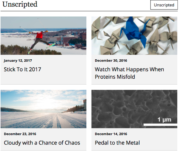
Use this snippet to display a feed of news, blog posts, or events on your page. You can combine multiple feeds. This snippet includes a styled heading and the option for buttons or social media links in the heading.


Use this snippet to display a feed of news, blog posts, or events on your page. You can combine multiple feeds. This snippet includes a styled heading and the option for buttons or social media links in the heading.
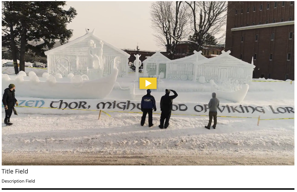
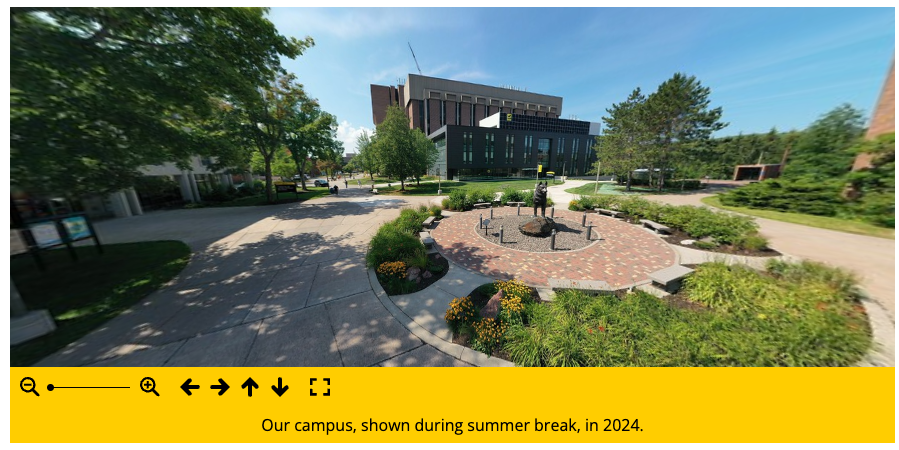
This snippet creates an embedded video or 360 image in your page’s main content area, additional content area, or right sidebar. To include a video at the very top of the page (known as the mediazone or hero area), follow the instructions for MultiEdit Content.
The size of the video/image will automatically adjust based on the location you insert it. A title and description can be included beneath it.
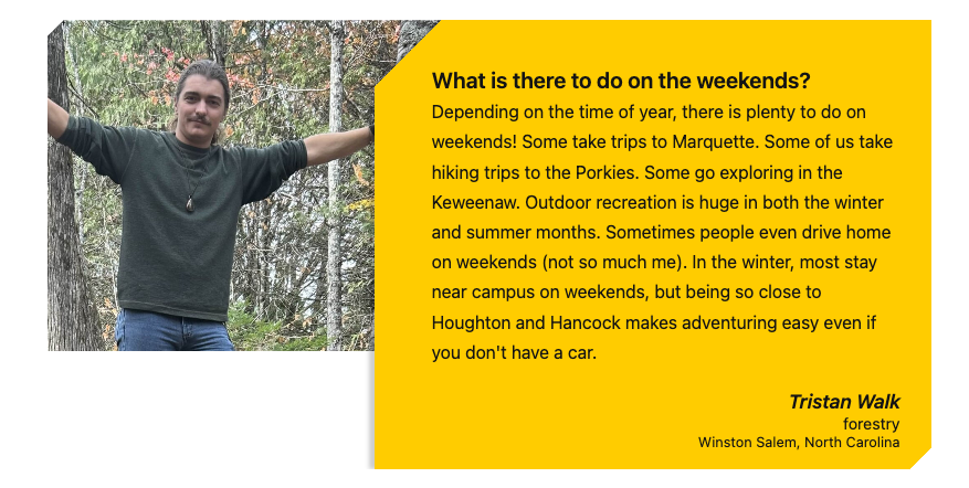
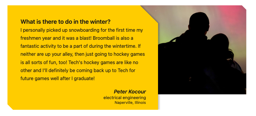
This snippet allows you to create a styled testimonial quote with a photo. The photo can go on the right or the left of the gold box.
This snippet creates a deck of YouTube videos that the user can scroll through, select, and play. You can use an existing YouTube playlist or multiple individual videos.

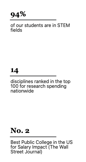
This snippet creates a row of statistic touts with either a vertical or horizontal colored line. The number or statistic part of the tout is larger and bolder and the remaining text appears beneath. The statistic can be linked or not.

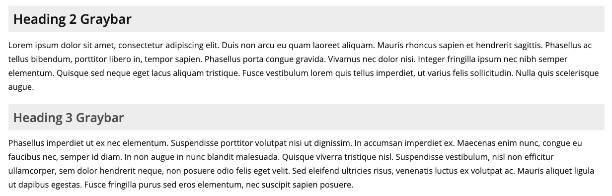
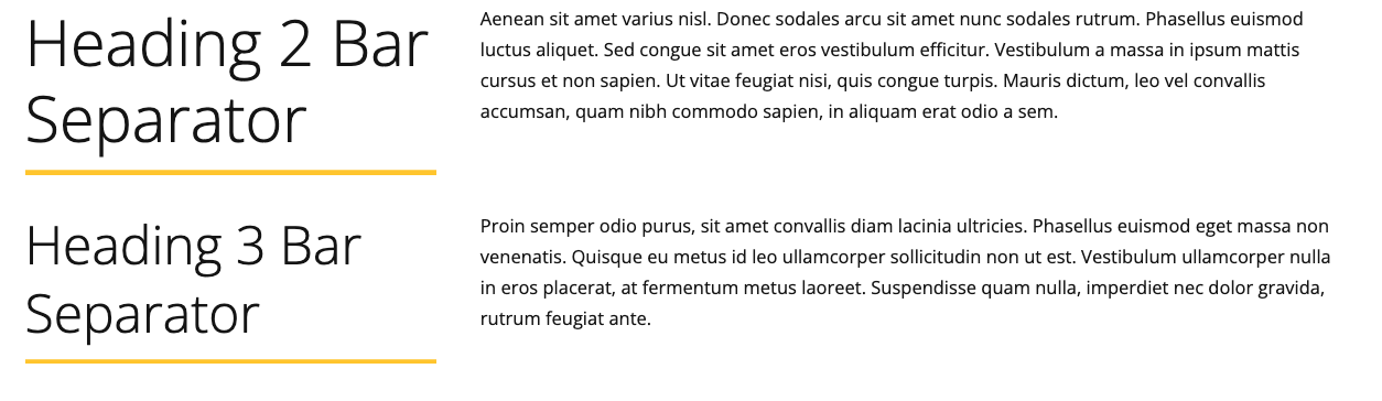
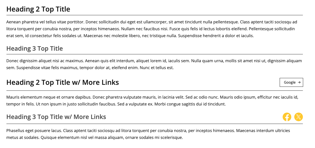
This snippet is used to create stylized level 2 or level 3 headings, including the Graybar, Bar Separator, Top Title, and Top Title w/ More Links. These stylized headings can be used in place of a regular heading 2 or heading 3. Except for special uses of the Bar Separator, you should be consistent with the style of a heading level you use throughout a webpage.
Snippets are inserted into an Editable Region to create styled widgets. From the toolbar, click the Insert Snippet icon.  Snippets can be added directly in the region or often nested within other snippets.
These snippets have been replaced with the H2|H3 Stylized Headings snippet.
This snippet has been replaced with the H2|H3 Stylized Headings Snippet.
