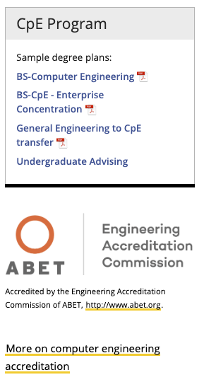
This snippet creates a space for adding content in the right sidebar with no additional special formatting. In the example below, the CpE Program section is a Sidebar Right: Box snippet and the ABET logo and bottom text are in a Sidebar Right: No Box snippet.
This snippet creates a shaded sidebar with a border and highlighted heading area.
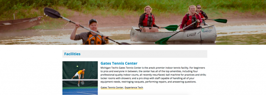
This snippet creates a layout with an image or an image and text on the left and heading/text on the right. You can choose whether or not to wrap the text on the right around the left content and whether or not to include a horizontal rule on the last item in the snippet.
The additional content region normally spans the entire screen width. Inserting a row snippet after full-width content will allow you to include content that only spans the main content region.
This snippet is no longer available. Instead, you can use the Image with Caption snippet (even if you don’t have a caption!) or link text directly to the image.
This snippet is used to put a list of faculty and staff on a page with different format options. You must first create a Personnel Information item for each person within the site being edited. If you want a heading, for example when you are listing multiple employee groups on one page, include an H2 Top Title or H2 Graybar snippet before this one.
This snippet creates a row of buttons that link to other pages or websites. The default button style is the “blank” style. When hovering over the button it gets a gold fill. The button width changes to fit all buttons evenly in the available area and the height changes to fit all link text. Learn more about button color strategy.
This snippet has been replaced with the Accordion Snippet.
This snippet creates a two- to five-column layout with the columns being evenly spaced in the available area or a two-column layout with one column being 2/3 of the space and the other 1/3. Text, images, videos, snippets, and assets can be added to each column. It can also be used to add a border around content.
This snippet should not be used to put bulleted lists or buttons into multiple columns. Instead, use the List Unordered Classes Snippet to split bulleted items into two or three columns or the Buttons in a Row Snippet to have up to five buttons next to each other horizontally.


