The Image Editor Gadget in the CMS will crop, compress, and optimize the images you create for your webpages. There is also code on our pages that serves up the most appropriate size of the image crops for the device being used. All images used in the CMS should be created with the Image Editor Gadget to ensure this code and the snippet code work, provide standard image sizes across our sites, and improve page speed and performance.
Adding images to your blog posts help break up the content, makes them visually appealing, and enhances your storytelling. By using keywords in the image filenames you can also help boost your Search Engine Optimization (SEO). Alternative text should always be included and captions are highly recommended, unless the reader can already understand the image content based on surrounding text.
Sizing Images
WordPress has a few size options available when you are adding your image. The sizes listed are the maximum size and may be reduced to fit the space available on various devices and will also vary based on the layout of sidebars on your blog site.
- Thumbnail: 150 px by 150 px (square)
- Medium: 300 px by 200 px (wide or tall)
- Large: 1024 px by 680 px (wide or tall)
- Full Size: the original size of your image
For original images larger than the Large size you should avoid using the Full Size option. The image will not display any bigger, but the Full Size image will slow down the webpage loading speed.
The system will not scale or stretch any images to be larger than their original size. If your original image dimensions fall below one of the listed maximum sizes, that option will not be available for you to insert.
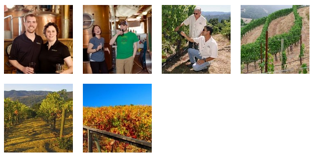
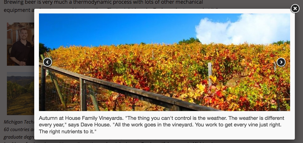
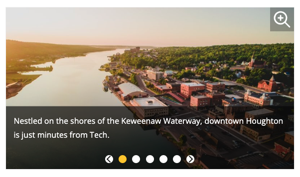
This snippet will create a grid of thumbnail images that pop up into a scrollable gallery when a thumbnail is selected or a gallery of larger images that the user can scroll through that also pop up into a larger image. For the thumbnail option, only the pop-up image will display the title caption, but they will be displayed on the page for the gallery option.
This snippet will automatically flow multiple images or other items into a grid layout. The size of the image will be maintained. This is a great option for displaying multiple logos or other images that do not fit into the predefined Image Editor sizes.
All images are created in the CMS using the Image Editor gadget. You can crop specific sizes using the gadget, insert the cropped images in pages, and replace existing images. The image editor will automatically optimize and publish the images. Make sure the image that you’re uploading is less than 25 MB so that it is able to be used in the editor. All images used in the Image Editor must be RGB format, not CMYK.
A gadget is a little program that provides additional functionality or streamlined access to functionality within Modern Campus CMS. Additional gadgets may be created at any time and gadget access may be limited by a user’s permissions. Some gadgets are only located on the Dashboard or on the Gadgets sidebar, while others are available in both locations.
Each individual user can choose which gadgets to show or hide on their Dashboard or Gadgets Sidebar; some gadgets are context-specific, meaning that they will only appear when viewing a page or inside an Editable Region.