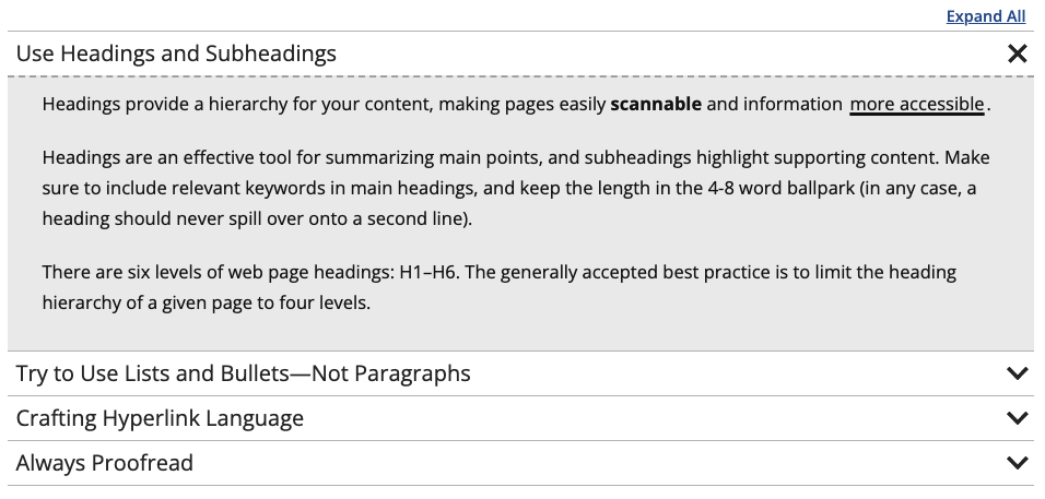
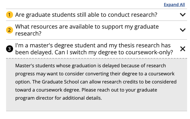
This snippet creates Slider- or FAQ-styled accordions. Clicking on one of the accordions would open or close that section. Each row in the snippet will create one accordion. Creating three or more accordions within one snippet would automatically add an Expand All/Collapse All link at the top right. If you have more than seven accordions together, it is recommended that you try to split them into multiple categories.
Each Modern Campus CMS website is required to have at least one designated web liaison to manage the daily maintenance of the site. The liaison is the main contact for the website for suggested edits, corrections, accessibility, etc. They also manage access requests. When a liaison is not designated, the dean, department head, or chair may be contacted in their place and is able to request access and perform other roles of the liaison.
Broken Links and Misspellings reports have been replaced with a new CMS Content Editors Dashboard.
Content managers may occasionally want to search for specific phrases within the content of their CMS website. To search your site for a specific phrase, follow these steps.
This snippet creates a single card with text over an image or colored background that links to another page or website. The slide out button can be customized. The spacing around each card is controlled in the Boxed Sections snippet that the Card is inserted into.
This snippet allows you to add classes to an unordered list that affect the styling. The is used when you have a list of many links rather than having them in paragraph form.
This snippet allows you to add a highlighted ranking that contains a number and description in the middle of regular text instead of using the Touts snippet. It should not be used to make colored text, only to highlight rankings. The ranking should never be linked. If a link is needed, link the source information in regular text after the ranking.
This snippet allows you to add a standalone ranking as an alternative to the Touts snippet. This looks best when not full-page width, such as in a boxed section as they are not very wide. The link and second line of italic text are optional.
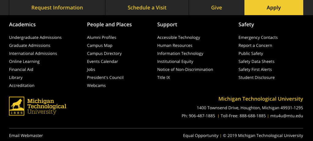
You can choose to add call-to-action buttons at the top of the footer on your website. You can choose to add just the Give button linked to a page of your choice, just the recruitment buttons with preset links, or all four. The default is no buttons. This is only available in the _props.pcf file within the root folder for your site or the folder where navigation is restarted.


